What is Responsive Web Design
More than half of internet users access the internet by using a mobile device. A responsive website design is necessary if you want to maximize your user reach and grow your business.
At Ajroni, we are adamant about helping companies to grow and offer professional, responsive web design services to build sites that attract visitors and maximize lead conversion and sales.
Responsive web design aims to make a website adapt and respond to the user’s device, screen size, and orientation. This way users will have no trouble reading the content, viewing images, or navigating the site regardless of the device they use.
The responsive design prioritizes user experience by making it easier for users to navigate through the website and find any content they want to access. The primary goal is to create a seamless and consistent browsing experience for all devices that eliminates the need for different layouts for each device.
To achieve this goal, responsive web design uses fluid grids, flexible images, media queries, and other elements that allow us to adjust the screen size, move elements around, and update formatting based on the screen size and type.

Benefits of Hiring a Responsive Web Designer
There are many benefits to having a responsive web design. First and foremost, it enhances user experience. Regardless of the device layout or size, a responsive design provides a seamless user experience by adjusting the layout, content, images, etc., to fit the screen properly. This is a must for improving engagement and user satisfaction and ultimately getting better results.
Furthermore, a responsive web design helps with on-page search engine optimization. Google prioritizes mobile-friendly websites over those that aren't because most internet users use mobile phones. Having a mobile-friendly website can maximize the potential user reach and grow your business.
Moreover, investing in a responsive web design helps keep your website maintenance and development costs low because your website only requires one design that fits all devices.
This is where Ajroni comes in. We are a professional, responsive web design company helping businesses in the US grow by building beautiful and functional websites that look great on any device. Whether you need a new website or are revamping an existing one, our responsive web design services can help ensure your business stays competitive in today's digital landscape.

Our Responsive Web Design Process
#1 Discovery and Planning
In this step, we lay the foundation for our project by carefully analyzing, researching, and understanding your business, competitors, goals, and selling points to create a powerful strategy. This step includes client consultation, market research, content strategy, technical planning, and project timelines.
#2 Design and Development
We bring your website vision to life by creating a beautiful and engaging website while ensuring that the website looks great on any device, size, or type. We implement responsive design elements, layouts, and features. Furthermore, we ensure the website is accessible by people with disabilities per ADA Compliance to maximize your reach and prevent potential lawsuits.
#3 Testing and Quality Assurance
During this step, we evaluate your website to ensure all the functionalities are in place and the website looks excellent in different browsers and devices. We perform cross-browser and device testing to ensure the website is of the utmost quality and fix any identified issues.
#4 Launch and Support
In the last step, we deploy the website to a live environment. Our team provides ongoing technical and customer support to help transition and maintain the website. We constantly perform updates and scans to ensure your website is secure and running smoothly 24/7.
Responsive Web Design Technologies and Tools
At Ajroni, we use many tools to deliver responsive websites. We are versed in providing sites of the highest quality, performance, and user experience.
- HTML5 and CSS3: We follow the latest standards to create clean code that is mobile-friendly, manageable, and easily editable for future changes.
- CSS frameworks (e.g., Bootstrap, Foundation) : We use popular CSS frameworks such as Bootstrap to streamline our web design process. These frameworks provide pre-build grids, components, and elements that enable us to deliver high-quality web designs.
- JavaScript and jQuery: We employ JavaScript and JavaScript frameworks such as jQuery to add interactions, animations, and complex functionality to the website to elevate user experience and make your website stand out.
- Content management systems (e.g., WordPress, Drupal, Joomla): To empower your business and allow you to manage website content easily, we use common CMS such as WordPress. These platforms provide a user-friendly admin interface that does not require programming knowledge and allow you to make changes throughout the website.
- Design software (e.g., Sketch, Adobe XD, Figma): Our designers use the latest and best design software, such as Adobe products, to create stunning designs. These design tools allow us to create web designs that stand out from the competition and align with your vision.
- Testing and optimization tools : We use various testing and optimization tools to ensure the website is mobile-friendly and optimized for results. These tools identify any issues in cross-browser compatibility, responsiveness, and load time and help us provide an exceptional user experience.
How much does a responsive website design cost?
The price for a responsive website varies a lot. It depends on the number of pages, site content, animations, images, etc, that can make a website cost anywhere from $1500 to $10,000 and more. For an accurate cost, don't hesitate to get in touch with us and provide the details, and we will give you a precise cost and timeline for your website.
Why choose Ajroni for your responsive web design services?
We are a client-centric responsive web design agency delivering high-quality customized solutions custom-tailored to your unique business goals and needs. Our track record of client testimonials and reviews is a testament to our expertise and ability to deliver exceptional websites consistently.
Our dedicated management approach and result-driven mindset set us apart from other agencies. From the first step until the last, we work closely with our clients to ensure transparent communication, progress updates, and seamless collaboration. We focus on delivering results that lead to a successful and impactful website for your business.
View Our Portfolio
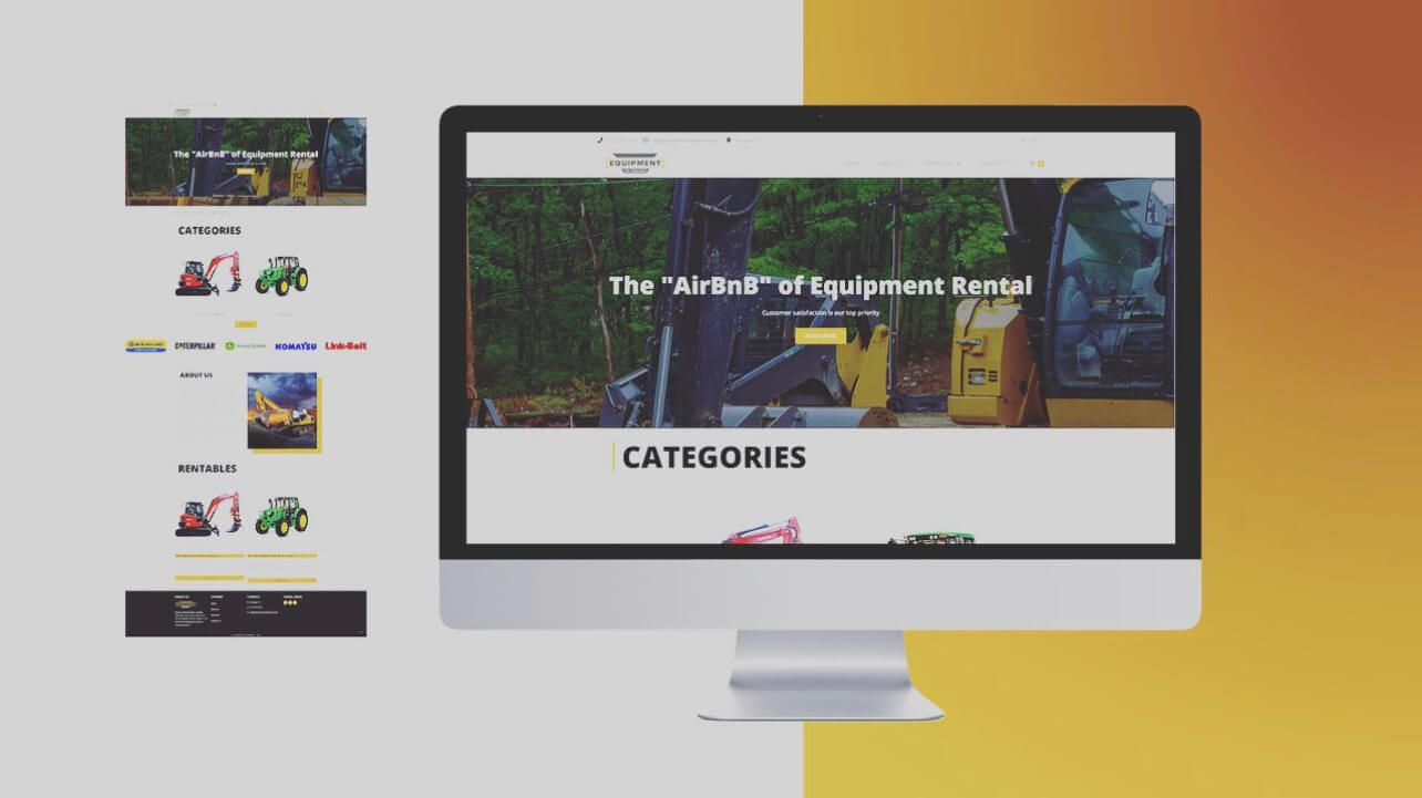
Equipment Rental - Tennessee
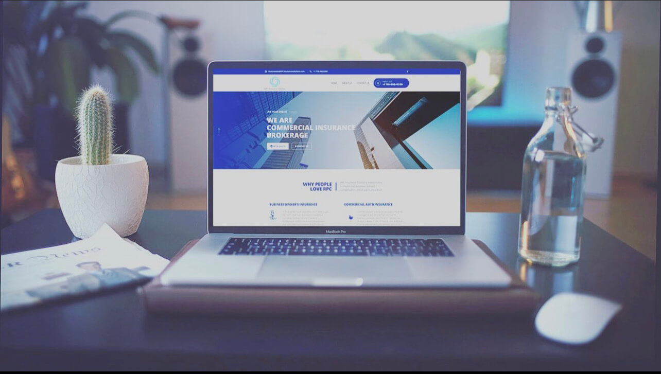
RPC Insurance - New Jersey
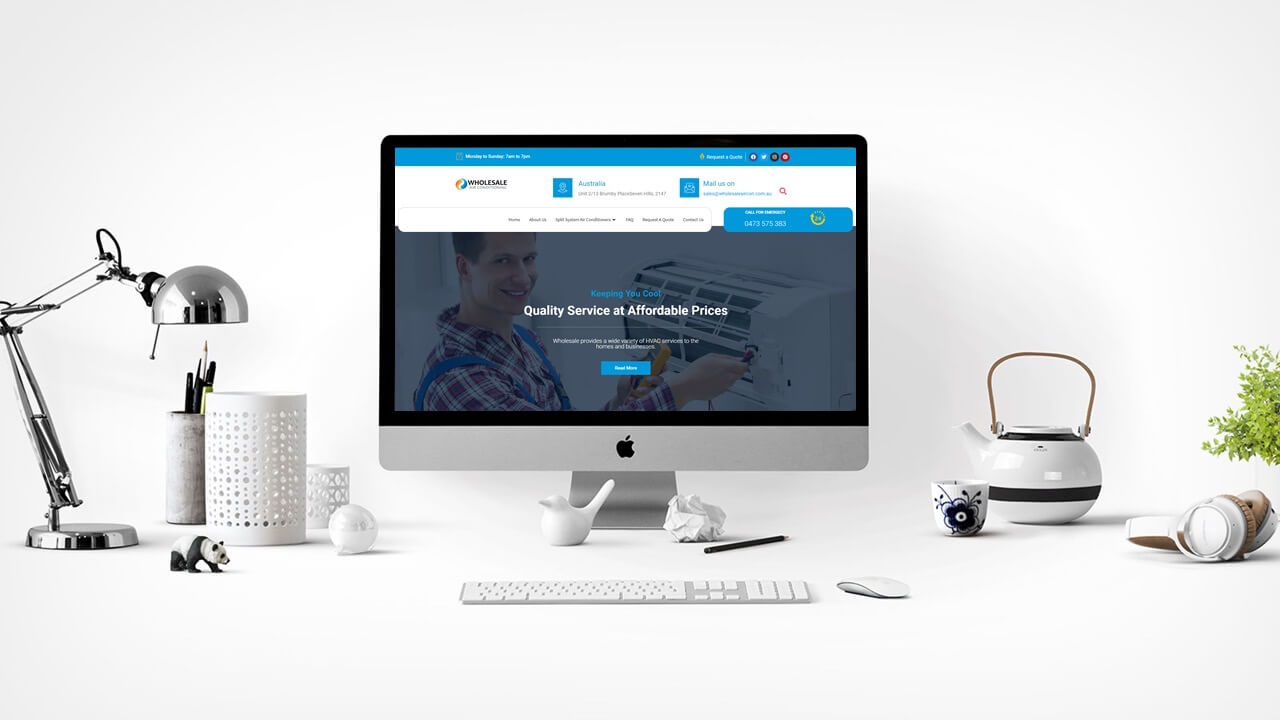
AC Wholesale Air -Australia
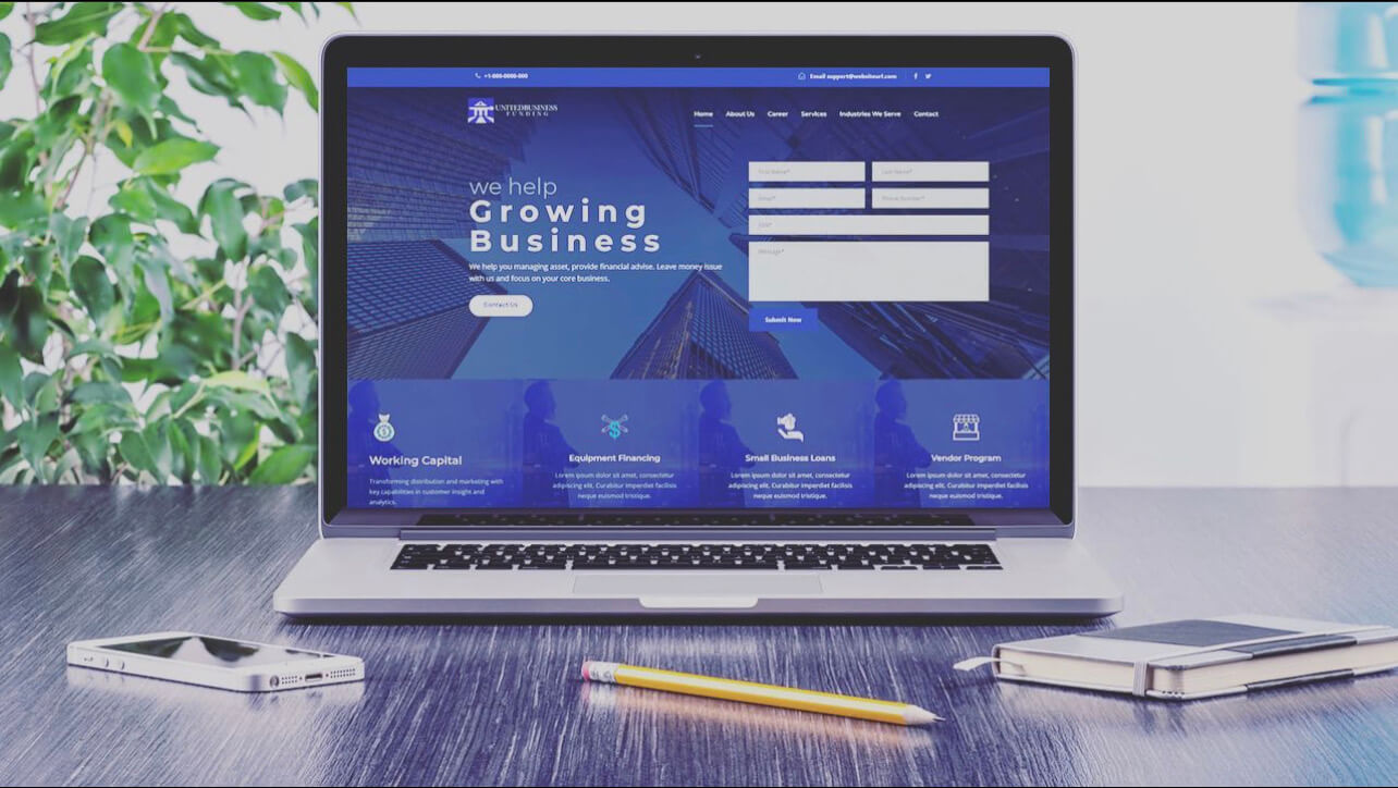
United Business Funding -USA
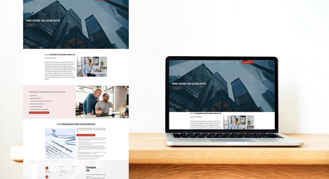
Costa Rica - Miami Real Estate

Bar Tenders Platform - NY
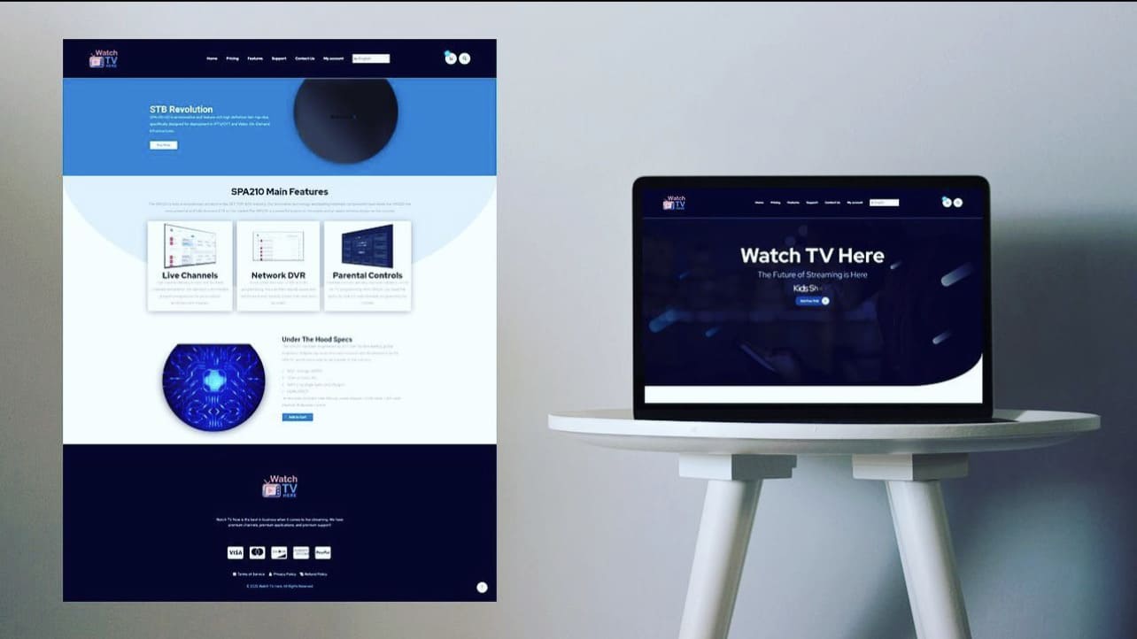
IPTV California
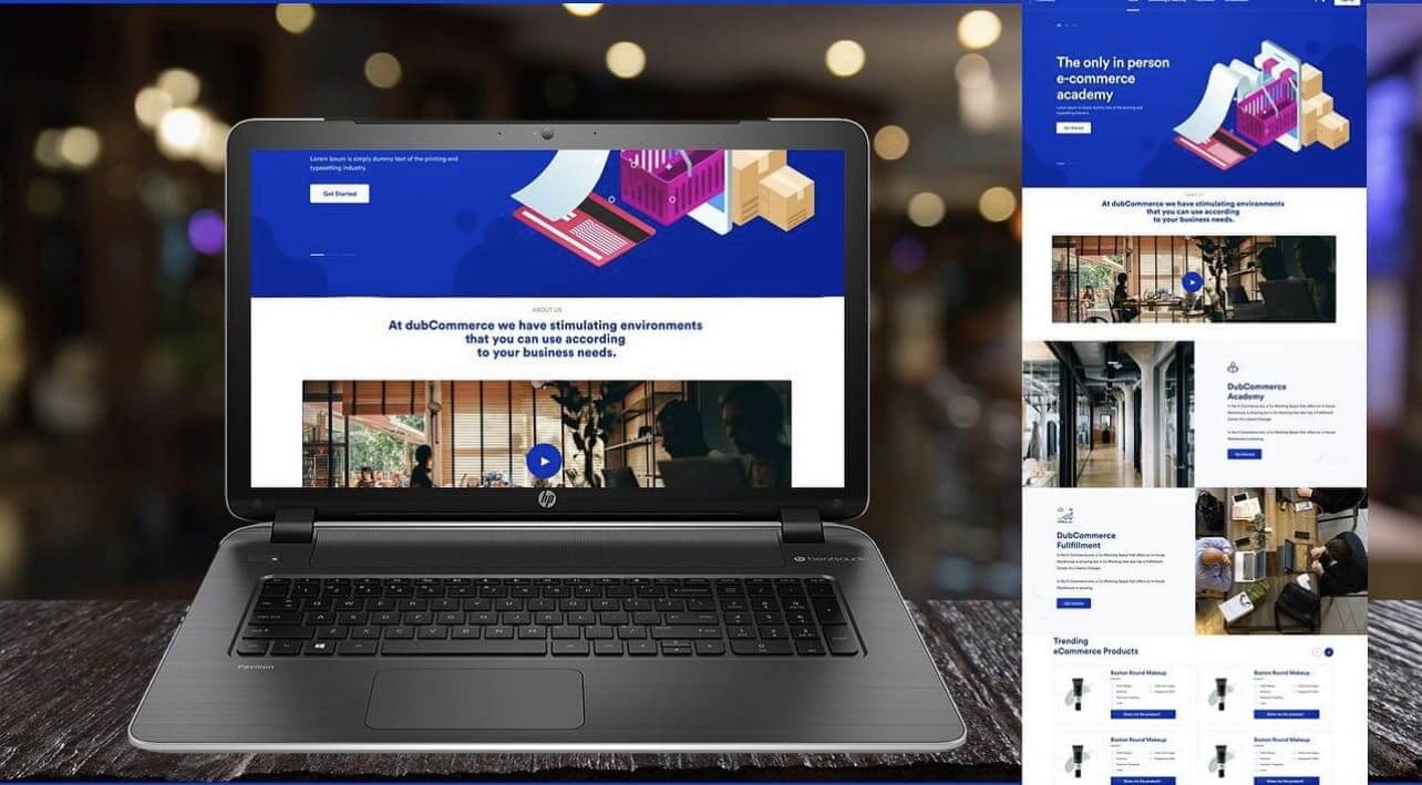
ClubCommerce - Miami
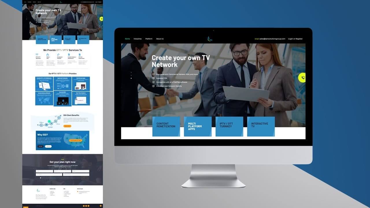
ISG IPTV - California
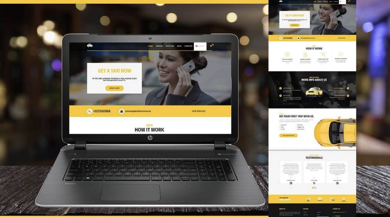
Taxi
Our Client Testimonials
Ready to get started?
Please fill out the contact form below, so we will be in touch within 24 hours.