In the rapidly evolving digital landscape, web design captures users' attention and creates a seamless browsing experience. In 2023, businesses and individuals must stay updated with the latest web design elements that can significantly impact their online presence. This blog will delve into the key web design elements shaping the industry this year: enhancing user experience, optimizing aesthetics, and driving engagement. You can create a compelling online platform by incorporating these elements into your website that captures attention, boosts conversions, and leaves a lasting impression on your visitors.
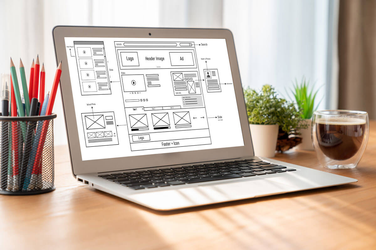
1. Understanding the Elements of Web Design
1.1 The Significance of Web Design
Web design encompasses various visual and functional elements that determine how a website looks and performs. It includes:
- layout,
- color schemes,
- typography,
- navigation,
- user experience (UX).
A well-designed website captivates visitors, communicates the brand's message, establishes credibility, and facilitates user interaction. By understanding and implementing the essential elements of web design, businesses can create an impactful online presence that stands out in today's competitive digital landscape.
1.2 Elements of a Good Website
A website should incorporate several key elements to ensure an optimal user experience and drive engagement. These elements include:
- Clear and Intuitive Navigation: Users should be able to navigate through the website effortlessly, easily finding the desired information.
- Consistent Branding: Maintain consistent visual elements, color schemes, and typography that reflect your brand identity across the website.
- Compelling Visuals: Utilize high-quality images, videos, and graphics that resonate with your target audience and enhance the overall aesthetics.
- Responsive Design: Ensure your website adapts seamlessly to various devices and screen sizes, providing an optimal user experience.
- Fast Loading Speed: Optimize your website's loading speed to reduce bounce rates and keep visitors engaged.
- Engaging Content: Craft informative and persuasive content that effectively communicates your message and encourages users to take action.
- Call-to-Action (CTA) Buttons: Strategically place clear and prominent CTAs throughout the website to guide users towards desired actions.
- Social Media Integration: For greater exposure and engagement, include social sharing buttons and connections to your social media profiles.
- Search Engine Optimization (SEO): Implement SEO best practices to increase the visibility of your website in search engine results and generate organic traffic.
By incorporating these elements into your web design strategy, you can create a visually appealing website that provides an exceptional user experience.
2. Responsive Web Design: Catering to All Devices
A website designed responsively is of utmost significance in this digital age. Responsive design ensures a website looks awesome and operates smoothly on all devices, from smartphones, tablets, and laptops to desktops. It grants customers an optimally enhanced viewing experience no matter what gadget they use.
Responsive web design allows the site's content and layout to be modified dynamically depending on the device's size. Visitors can use any device with ease and convenience whenever they access the site.Visitors can always access and communicate with your website effectively regardless of device.
Having a responsive website offers several advantages:
- It eliminates the need for separate mobile and desktop versions of your site, saving time and resources.
- It improves your website's search engine rankings, as search engines like Google prioritize mobile-friendly websites.
- A responsive design boosts user satisfaction, as visitors can navigate through your site effortlessly, regardless of their device.
To achieve a responsive web design, consider the following practices:
- Use a mobile-first approach, designing the website primarily for mobile devices and then scaling up for larger screens.
- Implement flexible grids and layouts that adjust fluidly to different screen sizes.
- Optimize images and multimedia for fast loading on mobile devices.
- Prioritize important content and CTA buttons to ensure they remain visible and easily accessible on smaller screens.
- Test your website's responsiveness using various devices and screen sizes to identify and fix any issues.
Adopting a responsive web design approach ensures your website delivers a consistent and engaging user experience across all devices.
3. Minimalistic Design: Less is More
Minimalism has become a highly sought-after concept. Striving for simplicity, clean lines, and an orderly interface, minimalistic design focuses on giving users a visually appetizing yet user-friendly experience. By weeding out needless elements and emphasizing essential ones, minimalistic designs draw attention to the most pertinent aspects while contributing to readability and delivering an aura of sophistication and class.
One of the key principles of minimalistic design is the idea that "less is more." This approach embraces simplicity and aims to remove extraneous elements that could distract or overwhelm the user. By reducing visual clutter, minimalistic design allows users to focus on the website's core content, messages, and functionality.
Here are some key characteristics and benefits of minimalistic design:
- Clean and Uncluttered Layout
- Clear Typography
- Limited Color Palette
- Emphasis on Negative Space
- Enhanced User Experience
- Reflects Brand Identity
- Adaptability and Timelessness
Remember, the key is to carefully consider each element, eliminate unnecessary clutter, and focus on creating a clean and harmonious visual experience that aligns with the brand's identity and resonates with the target audience.
4. Microinteractions: Enhancing User Engagement
Microinteractions refer to subtle, interactive elements incorporated into a website's design that provide feedback, guidance, and enhance the overall user experience. These small, often overlooked details play a significant role in engaging users, creating a sense of delight, and making interactions with the website more intuitive and enjoyable.
Microinteractions can take various forms, such as button animations, hover effects, progress indicators, form validations, tooltips, notifications, and more. They are designed to communicate information, acknowledge user actions, and guide users through the website's functionalities. While seemingly small, these interactions greatly impact user engagement and satisfaction.
Here are some key characteristics and benefits of microinteractions:
- Feedback and Response
- Intuitive and Guided Interactions
- Delightful User Experience
- Enhanced User Engagement
- Brand Differentiation
- Mobile-Friendly Interactions
The key is to balance functionality and aesthetics, ensuring that microinteractions are purposeful, subtle, and add value to the user experience without overwhelming or distracting users from the website's core content and objectives.
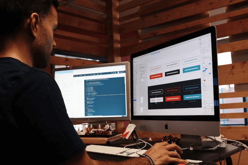
5. Bold Typography: Making a Statement
Manipulating type in the design of a website is a key element in creating a successful user experience. Bold typefaces have become an increasingly popular method of driving engagement and increasing the aesthetic allure of a web page. Not only do bold fonts convey messages, they are also effective at establishing hierarchical sequences and making solid statements that stand out from the rest of your page's content.
Here are some key characteristics and benefits of bold typography:
- Visual Impact
- Hierarchy and Readability
- Brand Identity and Personality
- Contrast and Emphasis
- Mobile Responsiveness
- Creative Expression
When using bold typography, it's essential to balance impact and legibility. Ensure that the chosen fonts are easily readable, even in larger sizes, and that the overall design remains cohesive and harmonious. To produce a visually arresting and functional design that makes an impression, use strong font while keeping in mind the context, target audience, and company identity.

Illustrative image by Freepik
Designers can produce visually appealing websites that make a statement, communicate clearly, and improve user experience by utilizing the power of bold typography.
6. Dark Mode: Eye-catching and Energy-saving
Dark mode, a progressively fashionable style among web applications and websites, is also called night mode or dark theme. This color palette has an inky-black or a deep shade of gray for the background and the text along with other elements that are highlighted in lighter hues. It presents a markedly different experience compared to the traditional light theme and comes packed with numerous advantages for users and the environment all at once. Not only does Dark Mode look visually appealing, but itcan also enable users to enjoy a more comfortable viewing experience using less power.
Here are some key characteristics and benefits of dark mode:
- Enhanced Visual Appeal
- Reduced Eye Strain
- Improved Readability and Focus
- Battery Life and Energy Efficiency
- Accessibility Considerations
- On-trend and Contemporary
- Differentiation and Personalization

Illustrative image by Kjpargeter
When implementing dark mode, it's important to consider the user interface's overall usability and ensure that the contrast between the dark background and lighter text or elements is sufficient for readability. Additionally, providing a user-friendly toggle or preference setting for users to switch between dark and light modes is recommended to accommodate different user preferences and environments.
By incorporating dark mode into a website or application, designers can create a visually captivating experience, improve readability and focus, reduce eye strain, and contribute to energy conservation.
7. Immersive Multimedia: Engaging Visuals and Videos
In web design, integrating immersive multimedia elements, such as high-quality visuals and videos, has become a powerful tool to captivate users and enhance their browsing experience. Immersive multimedia goes beyond static images and text, offering dynamic and interactive content that can engage users on a deeper level.
Here are some key characteristics and benefits of immersive multimedia:
- Visual Impact
- Storytelling and Emotional Appeal
- Improved Information Retention
- Enhanced User Engagement
- Visual Demonstrations and Product Presentations
- Mobile Optimization
- Branding and Identity
It's important to balance visual appeal and performance when incorporating immersive multimedia elements. Optimize images and videos for fast loading times without sacrificing quality. Additionally, ensure that multimedia content is relevant, purposeful, and enhances the overall user experience. Avoid overwhelming users with excessive or unnecessary multimedia elements that may detract from the core content and objectives.
Integrating high-quality visuals, videos, and interactive media provides an opportunity to leave a lasting impression on users and differentiate a website or application from the competition.
8. Augmented Reality (AR) and Virtual Reality (VR) Integration: Blending Realities
The recent insurgence of Augmented Reality (AR) and Virtual Reality (VR) technology is utterly revolutionizing the web design landscape. With these emerging technologies, developers can bring digital content to life through interactive and immersive experiences beyond basic two-dimensional screens. By integrating AR and VR features into websites, users are vastly empowered to explore digital content with stellar engagement – bridging the gap between reality and virtual realms in a way never seen before.

Image by Envato
Here are some key characteristics and benefits of AR and VR integration:
- Immersive and Interactive Experiences
- Enhanced Product Visualization
- Gamification and Interactive Storytelling
- Virtual Tours and Simulations
- Brand Differentiation and Innovation
- Mobile Accessibility
- Learning and Training Opportunities

Illustrative image by Freepik
When integrating AR and VR into web design, it's important to consider device compatibility, performance optimization, and user accessibility. Ensure the experiences are compatible with various devices and browsers, and optimize the content for smooth performance. Additionally, provide clear instructions and guidance to users on interacting with the AR and VR elements, ensuring a seamless and intuitive user experience.
These technologies offer new ways for users to engage with digital content, visualize products, explore virtual environments, and learn in immersive ways.
9. Scrolling Transformations: Dynamic and Interactive
Scrolling transformations refer to the creative and interactive effects applied to the scrolling behavior on websites. Rather than simply scrolling up and down to navigate through content, scrolling transformations introduce dynamic elements and visual changes that engage users and create a more interactive browsing experience. These effects can range from parallax scrolling to animations triggered by scrolling actions.
Here are some key characteristics and benefits of scrolling transformations:
- Enhanced User Engagement
- Visual Hierarchy and Storytelling
- Smooth and Seamless Transitions
- Parallax Scrolling Effects
- Interactive Animations
- Visual Progress Indicators
- Performance Considerations
- Compatibility and Accessibility
By incorporating scrolling transformations, designers can create dynamic and interactive browsing experiences that engage users on a deeper level. These effects enhance user engagement and interactivity, add visual interest, and guide users through the content. With careful implementation and consideration for performance and accessibility, scrolling transformations can elevate the overall user experience and make the website more memorable and impactful.
10. Animation and Motion Graphics: Adding Life to Design
Animation and motion graphics have revolutionized web design, offering designers an array of possibilities to add an interactive dimension to sites. By injecting animation and motion into user interfaces, websites can captivate users with their visual appeal and make information more easily digestible. In addition to this, they can also animate static elements by bringing them alive for a uniquely engaging experience.
Here are some key characteristics and benefits of animation and motion graphics in web design:
- Visual Interest and Engagement
- Storytelling and Communication
- User Feedback and Interaction
- Delightful Microinteractions
- Visual Hierarchy and Focus
- Seamless Transitions and Flow
- Brand Personality and Differentiation
- Performance Optimization
- Accessibility Considerations
By leveraging animation and motion graphics, web designers can breathe life into their designs and create visually captivating and interactive experiences.
11. Intelligent Chatbots: Personalized Customer Support
Intelligent chatbots have become integral to modern web design, offering personalized and efficient customer support. These AI-powered virtual assistants are designed to simulate human conversations and provide instant assistance to users, enhancing the overall user experience and improving customer satisfaction.
Here are some key characteristics and benefits of intelligent chatbots in web design:
- Instant and 24/7 Support
- Personalized Interaction
- Efficient Issue Resolution
- Seamless Integration with Websites
- Multilingual Support
- Data Collection and Insights
- Cost-Efficient Customer Support
- Continuous Learning and Improvement
- Omnichannel Support
- Human Handoff and Escalation

Image by Storyset
Intelligent chatbots have revolutionized customer support by providing users instant, personalized, and efficient assistance. They enhance the user experience by offering 24/7 support, personalized interactions, and efficient issue resolution. Moreover, chatbots contribute to cost savings, data collection, and continuous improvement of customer support strategies. By incorporating intelligent chatbots into web design, businesses can elevate their customer service capabilities and provide a superior support experience for their users.
Conclusion
In the dynamic world of web design, staying updated with the latest trends and incorporating the right elements is crucial for creating a visually appealing, user-friendly, and engaging website. By implementing the top web design elements discussed in this article, such as:
- responsive design,
- minimalistic aesthetics,
- microinteractions,
- bold typography,
- dark mode,
- immersive multimedia,
- augmented reality integration,
- scrolling transformations,
- animation,
- accessible design,
- user-centric navigation,
- whitespace,
- intelligent chatbots,
- optimizing website loading speed,
you can enhance the overall user experience and drive conversions.
Remember, a well-designed website is visually pleasing but also functional, accessible, and optimized for performance, ensuring that your online presence stands out in a crowded digital landscape.
FAQs
1. What are the essential elements of web design?
Web design encompasses various essential elements that contribute to a successful website. These elements include:
- clear and intuitive navigation,
- consistent branding,
- compelling visuals,
- responsive design,
- fast loading speed,
- engaging content,
- effective call-to-action buttons,
- social media integration,
- search engine optimization (SEO).
Each element is crucial in creating a visually appealing, user-friendly, and functional website.
2. How does responsive web design impact user experience?
With Responsive Web Design, your website can provide a seamless experience to users regardless of the size of their screen. Content and layout will dynamically adjust with it, enhancing readability, navigation ease, and accessibility across different devices. It's essential to have an optimized web design that works across multiple platforms for a smooth user experience that ultimately increases engagement with your website.
Responsive design eliminates the need for separate mobile and desktop versions of a site and improves search engine rankings. By offering a consistent and user-friendly experience, responsive web design enhances user satisfaction and engagement.
3. Why is minimalistic design popular in web design?
The minimalist design is characterized by its focus on simplicity, clear lines and an uncluttered interface, which has become increasingly popular in web designs today. This style prioritizes essential elements like clear typography, expansive whitespace and the wise use of colors and visuals to make the website look aesthetically pleasing and easy to use. This approach ensures that readability is improved significantly, promotes a serene feeling and enables users to concentrate on what matters most - the key content and information of the website. The minimalistic design emphasizes less-is-more coding, making navigating through websites much simpler for visitors!
4. What role does typography play in web design?
Optimal typography is essential in web design as it plays a massive role in creating a beautiful, legible, distinct brand identity. Choosing the right fonts, font sizes and suitable font combinations can help convey your desired tone, cause emotional reactions and elevate the user experience. With proper typography, content looks sharp across different devices, has consistent theme throughout the website, and directs users to key data/information or messages.
5. How does website loading speed affect user engagement?
Website loading speed significantly impacts user engagement and overall website success. As online technology continues to evolve at breakneck speed, users have come to demand an exception website loading experience. When sites take too long to load, visitors are likely to leave the site quickly and ultimately miss out on opportunities for engagement or conversions due to being discouraged by the slow loading time.
On the contrary, pages that load faster can create a positive user experience that entices them to explore further and boosts search engine rankings. For improving website loading speed one has to contemplate various tricks such as optimizing images, pruning code down in size, caching tactics and harnessing content delivery networks (CDNs).