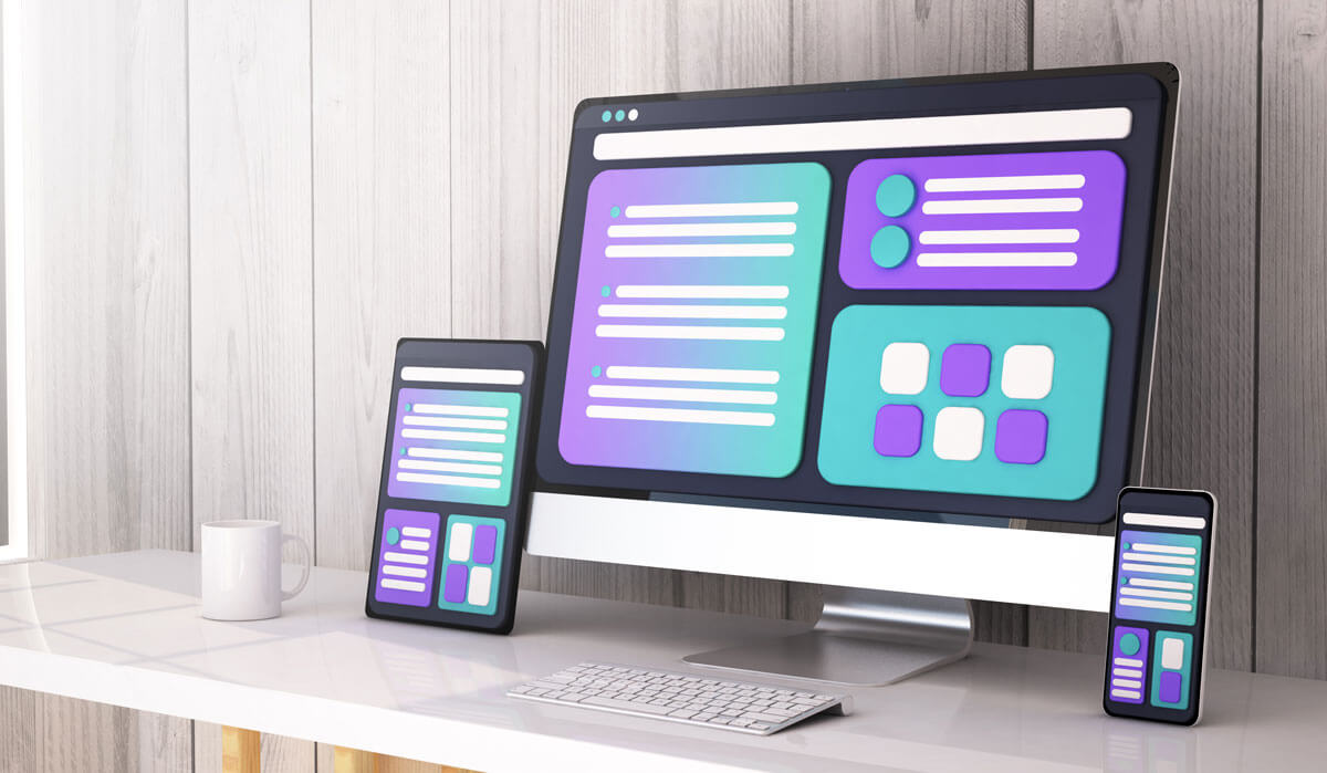
Responsive web design has become indispensable in today's digital age. We access the internet through various devices with different screen sizes. Responsive web design ensures that websites adapt seamlessly to your chosen device. It doesn't matter if you're browsing on a massive desktop monitor, a sleek laptop, or a compact smartphone. In this complete guide, we will explore responsive web design. We'll explain its main principles, elements, and why it is important for creating a great user experience.
Understanding Responsive Web Design
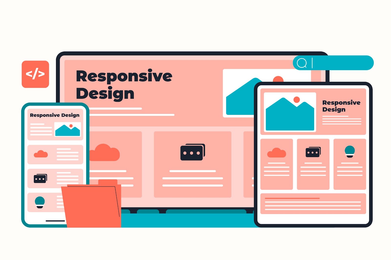
Image by Freepik
Responsive web design is a web development approach that prioritizes optimal viewing and interaction across various devices. It's about ensuring your website looks and functions flawlessly whether viewed on a large desktop screen or a tiny smartphone display.
Responsive Web Design Basics
To grasp the essence of responsive web design, let's break it down into its fundamental components:
1. Elements of Responsive Web Design
Responsive web design is based on a few important components:
Screen Size
The cornerstone of responsiveness, screen size, dictates how your website should adapt. Websites must gracefully adjust to accommodate the varying dimensions of screens, from widescreen monitors to tiny mobile devices.
Flexible Images
Images need to scale seamlessly to avoid pixelation or distortion. This involves using CSS (Cascading Style Sheets) to specify image dimensions in relative units rather than fixed pixels.
HTML and CSS
HTML and CSS are very important in web design. Proper structuring of HTML and well-defined CSS rules ensure that content flows naturally across devices.
2. User Experience
Responsive web design focuses on creating a great user experience. Users who access your website, regardless of the device, should enjoy a seamless and intuitive journey. Here are some key aspects to consider:
Font Size
Fonts should adapt to maintain readability. Small fonts on a desktop might be challenging to read on a mobile device. Responsive design adjusts font sizes to ensure content remains legible.
Range of Devices
Responsive web design caters to a vast array of devices, from smartphones and tablets to smart TVs and even wearable tech. This adaptability ensures your website's accessibility and usability.
Mobile Version
A mobile version of your website is often essential. It streamlines content and navigation for small screens, offering a tailored experience for mobile users.
According to statistics, as of May 2023, mobile devices account for 67.81% of all web visits, while desktops make up 32.19%.
The Impact of Responsive Web Design
1. Enhanced User Experience
Responsive web design results in a consistent and enjoyable user experience, regardless of device. This means that users will be more satisfied and engaged.
2. Improved SEO
Search engines like Google favor responsive websites. They are more likely to rank higher in search results, leading to increased organic traffic.
3. Cost-Efficiency
Rather than developing separate websites for different devices, responsive design streamlines development and maintenance, reducing costs in the long run.
4. Wider Reach
Responsive web design allows your content to reach a larger audience by making it accessible on different devices.
5. Analytics Simplicity
Managing analytics and tracking user behavior is more straightforward with a single responsive website. You get a unified view of user interactions.
The Role of Screen Size in Responsive Design
Screen size is a crucial factor in responsive web design. Let's delve deeper into its significance.
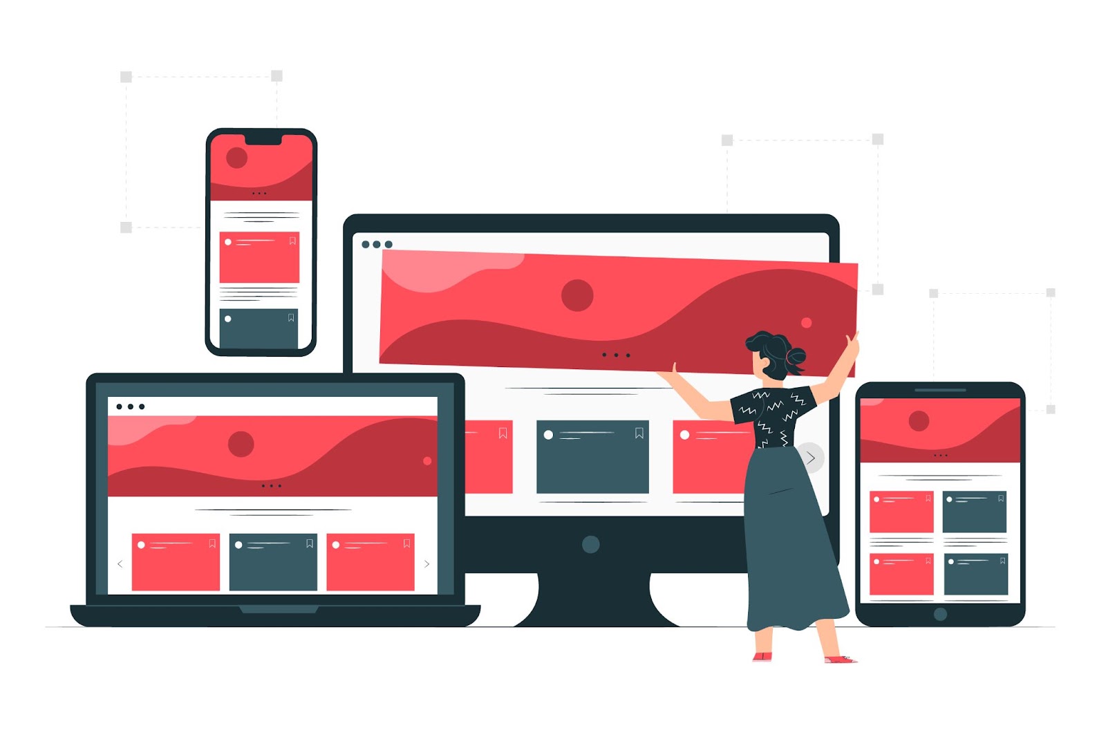
Image by Freepik
Screen Size Matters
Your website should adapt gracefully to various screen sizes, from large to small. Responsive web design achieves adaptability by using a fluid layout and media queries. These tools adjust the content and design elements depending on the user is device.
Based on the data from Worldwide Screen Resolution Stats (Sept 2021 – Sept 2022), some of the most popular screen resolutions across mobile, desktop, and tablet devices are:
- 1920×1080 (9.94%)
- 1366×768 (6.22%)
- 360×640 (5.88%)
- 414×896 (4.21%)
- 1536×864 (3.94%)
- 375×667 (3.74%)
These are the resolutions that people commonly use to view websites on their devices during this time period according to the stats collected globally.
Benefits of Prioritizing Screen Size
1. Cross-Device Compatibility
When you prioritize screen size, your website will look great and work well on all devices, including desktops and smartphones.
2. Consistent Branding
Consistency in design and branding is maintained, regardless of the device. This helps reinforce your brand identity to all users.
3. Improved User Engagement
When a website looks good and functions smoothly on any screen size, it encourages users to stay longer and engage with your content.
Media Queries: Adapting to Screen Size
Making sure that your website looks great on all devices is important, and media queries play a big role in achieving this. These CSS rules allow web developers to specify styles and layouts based on screen characteristics, such as width and height.
Using Media Queries
Developers use media queries. These queries help set rules for changing font sizes, hiding or showing specific elements, and adjusting image dimensions based on the screen size.
Creating Breakpoints
Breakpoints are specific screen widths at which design elements change. For example, you can have a breakpoint when the screen width is below 768 pixels. This adjusts the layout, making it more suitable for tablets and mobile devices.
The Crucial Role of User Experience
User experience is the linchpin of responsive web design. It's not just about making your website look good on various devices; it's about ensuring users can interact smoothly and find the information they seek.
Prioritizing User Experience
Mobile-Friendly Navigation
On smaller screens, it's essential to simplify navigation. Consider a mobile-friendly menu that collapses or expands when needed, ensuring easy access to different sections of your website.
Touch-Friendly Design
Mobile users interact with their screens using touch gestures. Ensure that buttons and interactive elements are adequately sized and spaced to accommodate fingers of all sizes.
Content Prioritization
Not all content needs to be visible on every device. Use responsive design techniques to prioritize content based on user needs and screen space. This ensures that users always see the most relevant information.
Best Practices for Creating Responsive Websites in 2023
Creating a responsive website that excels in 2023 involves following the latest best practices to meet the evolving demands of users. Here are some essential guidelines:
1. Mobile-First Design
Start your design process by considering the mobile experience first. Designing for smaller screens forces you to prioritize essential content and streamline navigation, ensuring a solid foundation for larger devices.
2. Performance Optimization
Faster loading times are crucial for user retention. Optimize images, minimize code, and leverage content delivery networks (CDNs) to enhance website speed across all devices.
3. Test Extensively
Test your website on a variety of devices and browsers to ensure a consistent user experience. Embrace responsive design testing tools and user testing to identify and rectify issues.
4. Use High-Resolution Images
High-resolution images ensure that your website looks crisp and professional on all devices. Implement responsive image techniques to load appropriate image sizes based on screen resolution and device capabilities.
5. Implement Fluid Grids
Utilize fluid grids and relative units like percentages for layout design. This approach allows your content to adapt smoothly to different screen sizes, from large desktop displays to small smartphone screens.
6. Prioritize Content
Content is king, and its presentation matters. Prioritize content based on user needs and screen space, ensuring that users always have access to the most critical information.
7. Use Responsive Frameworks
Leverage responsive frameworks like Bootstrap and Foundation to expedite the responsive design process. These frameworks provide pre-built components and styles optimized for various devices.
8. Keep Accessibility in Mind
Make certain that your website is accessible to everyone, including individuals with impairments. Use proper HTML semantics, provide alternative text for images, and ensure keyboard navigation works flawlessly.
9. Monitor Analytics
Continuously monitor website analytics to identify areas that require improvement. Track user behavior on various devices and make data-driven adjustments to enhance the user experience.
10. Stay Updated
Stay updated on the latest trends and technologies in web design. The web landscape evolves rapidly, and keeping your skills and website up-to-date is crucial for long-term success.
FAQs
What is responsive web design?
Responsive web design is a way to make websites that can adapt and look good on different devices. It ensures that websites may be readily adapted to numerous screen sizes and devices This way, it provides the best user experience possible.
What are the basics of responsive web design?
Responsive web design basics include:
- Screen size adaptation.
- Flexible images.
- Proper HTML and CSS structuring.
- Font size adjustments.
- A focus on user experience.
How does screen size affect responsive web design?
Responsive web design relies on screen size to determine how content and design elements should adjust. The goal is to deliver an engaging and consistent user experience.
Why is user experience important in responsive design?
User experience is vital in responsive design because it determines how users interact with your website on various devices. A seamless and intuitive experience leads to higher engagement and user satisfaction.
How can I implement responsive web design for my website?
Consider employing a professional web developer familiar with responsive design strategies to implement responsive web design. They will ensure your website adjusts to multiple screen widths, enhancing user experience and search engine exposure.
To summarize, responsive web design is no longer a trend but a requirement in today's digital ecosystem. Understanding the core principles of responsive web design is essential for creating websites that operate well on many devices. Adapting to varied screen widths, employing adaptable pictures, and prioritizing user experience are just a few examples.
When you prioritize responsive design, you make users happier, boost your SEO rankings, and reach more people on different devices. As a result, everyone has a better online experience.