In graphic design, alignment is a powerful yet often underestimated tool that can make or break a design's impact. Alignment is the invisible force that brings harmony, structure, and clarity to your creations. Whether you're an experienced graphic designer or starting, understanding and mastering alignment is crucial.
1. Introduction to Alignment in Graphic Design
Alignment is crucial. It helps you create visually cohesive compositions. These compositions capture attention and effectively convey your message.
Image by Freepik
In this comprehensive guide, we'll delve deep into the world of alignment in graphic design. We will give you the knowledge and skills to elevate your design game. We'll cover fundamental principles and different types of alignment techniques. So, let's align our thoughts and embark on this creative journey together.
Graphic design is the art of visual communication, and alignment plays a pivotal role in conveying your message effectively. In design, alignment means arranging elements and making sure they are positioned correctly in relation to each other. When done correctly, alignment creates a sense of order, hierarchy, and professionalism.
Effective alignment serves several essential purposes in graphic design:
- It guides the viewer's eye and leads them through the content.
- It establishes a clear visual structure, making information easy to digest.
- It enhances the overall aesthetics and impact of your design.
In essence, alignment is the backbone of good design, the invisible glue that holds everything together.
2. The Fundamental Principles of Alignment
2.1 The Rule of Thirds
The Rule of Thirds is a basic but powerful principle of alignment. It divides your canvas into nine equal parts by overlaying two equally spaced horizontal and vertical lines. The intersections of these lines are strategic points where you should place important elements like focal points, text, or key visuals. This technique has two benefits: it adds balance and it makes your composition more visually interesting.
2.2 Grid Systems
Grid systems are organized frameworks that help align elements in a clear and systematic way. They consist of columns, rows, and guides that help you precisely organize and align elements. Grids bring order to your designs, ensuring consistency and coherence across text, images, and graphics.
2.3 Balance and Symmetry
Balance and symmetry are closely related to alignment. A balanced composition ensures that no element overwhelms the others, creating a harmonious visual experience. Whether horizontal, vertical, or radial, symmetry can create a sense of equilibrium and elegance in your designs.
We have learned the basic principles of alignment. Now, let's look closer at the various alignment techniques you can use in graphic design.
3. Types of Alignment in Graphic Design
Alignment is a versatile tool with various applications. Let's look at primary alignment types and how they influence your designs.
3.1 Vertical Alignment
Vertical alignment refers to the arrangement of elements along a vertical axis. It's often used to ensure that text, images, or graphics line up neatly along a common vertical baseline. This type of alignment brings order and readability to your designs, making them more visually appealing.
3.2 Horizontal Alignment
Horizontal alignment involves positioning elements along a horizontal axis. This is crucial for maintaining consistent spacing and positioning in your design. It helps establish a clear visual hierarchy and guides the viewer's eye across the composition.
3.3 Left Alignment
Left alignment, flush left or ragged right, aligns text or elements along the left margin while allowing the right edge to vary. This is the most common text alignment in Western cultures and promotes readability.
3.4 Center Alignment
Center alignment centers text or elements both horizontally and vertically. It creates a sense of symmetry and is often used for titles, headings, or logos. However, overusing center alignment can lead to a lack of structure in your design.
3.5 Justified Alignment
Justified alignment aligns text or elements along the left and right margins, creating a neat and tidy appearance. While it can provide a clean look, it may lead to uneven word spacing, affecting readability.
These alignment techniques form the foundation of organized and visually appealing graphic design. However, alignment doesn't exist in isolation; it interacts with other design elements, such as white space and invisible lines. Let's explore their role in achieving visual cohesion.
4. The Role of White Space in Alignment
White space, also known as negative space, is the unmarked area around and between elements in a design. It might be "empty," but it's far from insignificant. White space is critical to alignment, providing breathing room for aligned elements to shine.
Consider a cluttered design with minimal white space—it can feel overwhelming and confusing. A well-balanced use of white space improves alignment. It enhances the impact of your design, making it visually pleasing and easy to navigate. White space allows the viewer's eyes to rest and focus on aligned elements.
5. Understanding Invisible Lines
Alignment often involves working with invisible lines—imaginary guides that help you position elements precisely. These lines may not be visible in the final design but are crucial in creating order and consistency.
Two primary types of invisible lines are:
- Baseline: The baseline is a horizontal line that text aligns to. Ensuring text aligns to a common baseline is essential for readability and a polished look.
- Gridlines: Gridlines, as mentioned earlier, are part of grid systems. They provide a structured framework for aligning various design elements.
By understanding and using these invisible lines, you can achieve precision and maintain visual coherence in your compositions.
6. The Power of Left Aligned Text
Left-aligned text, flush left or ragged right, is popular for readability and accessibility. It's a simple yet effective alignment technique that helps readers follow the text flow naturally.
When you left-align your text, it forms a clear and consistent left edge, making it easier for readers to scan and absorb information. This alignment style is especially effective for body text, paragraphs, and lists in documents, websites, and other forms of communication.
7. Aligning Elements in Graphic Design
Alignment extends beyond just text; it encompasses all elements in a design, including images, graphics, icons, and more. Consistently aligning these elements creates a cohesive and polished visual experience for your audience.
Here are some key considerations for aligning different elements:
- Images and Graphics: Align images and graphics with text or other elements to maintain a unified look. For example, aligning an image to the top of a text block can create a seamless connection between visual and textual content.
- Icons and Symbols: When using icons or symbols, ensure they align with surrounding text or other design elements. This alignment prevents visual dissonance and reinforces the message you want to convey.
- Shapes and Text Boxes: Align shapes and text boxes to maintain a clean and organized layout. Grid systems are particularly helpful for aligning these elements precisely.
Alignment is the key to creating a visually cohesive composition. It helps achieve harmony among all design elements, making your work resonate with your target audience.
Image by Freepik
8. Using Alignment in Digital Platforms
Alignment is not limited to print media; it also plays a significant role in digital design. Websites, mobile apps, and social media graphics all benefit from precise alignment techniques.
In digital design, alignment helps in several ways:
- Responsive Design: Ensuring proper alignment is crucial for responsive web design. Elements must adapt to various screen sizes and orientations while maintaining alignment integrity.
- User Interface (UI) Design: In UI design, alignment guides users through the interface, making it intuitive and user-friendly. Buttons, menus, and content blocks should align logically for a seamless user experience.
- Social Media Graphics: On platforms like Instagram and Facebook, alignment is essential for creating visually appealing and shareable graphics. Proper alignment ensures that your message stands out and captures attention.
- Email Marketing: Alignment in email marketing campaigns enhances readability and ensures your message is delivered effectively to recipients.
9. Margins and Alignment
Margins are the spaces between the content of a design and the edges of the canvas or page. They serve multiple purposes, including framing the content and enhancing readability. Proper margins work hand in hand with alignment to create a polished design.
Consider these aspects of margins and alignment:
- Left and Right Margins: The width of your left and right margins can impact the alignment of your content. A balanced approach ensures that your design maintains a sense of proportion and professionalism.
- Top and Bottom Margins: These margins provide space for print media headers, footers, and page numbers. In digital design, they contribute to the overall visual balance and flow.
- Alignment to Margins: Aligning your content to the margins can create a structured and organized appearance. This is particularly important in print media, such as brochures and flyers.
10. Achieving Visual Cohesion with Alignment
Alignment's primary goal is achieving visual cohesion. This means that all elements in a design belong together and work harmoniously. Creating a visually cohesive composition is important. It helps capture and hold the viewer's attention, while effectively getting the message across.
To achieve visual cohesion through alignment, consider these tips:
- Consistency: Maintain consistent alignment throughout your design. Whether it's text, images, or other elements, keeping them aligned creates a sense of order.
- Hierarchy: Use alignment to establish a visual hierarchy in your design. Important elements should have more prominent alignment, while secondary elements should align with the primary ones.
- Balance: Seek a balance between different alignment techniques. A well-balanced composition will feel more natural and visually pleasing.
- Feedback: Don't hesitate to seek feedback on your designs. Fresh eyes can often spot alignment issues that you may have missed.
Now that we've explored the many facets of alignment in graphic design, let's consider some common mistakes to avoid.
11. Common Alignment Mistakes to Avoid
While alignment is a powerful tool, it's also easy to get wrong. Here are some common alignment mistakes to steer clear of:
- Inconsistent Alignment: Inconsistency can lead to confusion. Ensure all elements align correctly and maintain a uniform approach throughout your design.
- Overcrowding: Avoid cramming too many elements together. Proper white space is crucial for alignment to work effectively.
- Neglecting Margins: Ignoring margins can lead to elements being too close to the edge of the canvas or page, resulting in a cramped appearance.
- Overuse of Center Alignment: While center alignment can be effective for certain elements, excessive use can create chaos and disrupt the flow of your design.
- Ignoring Hierarchy: Failing to establish a clear hierarchy through alignment can make it challenging for viewers to understand the importance of different elements.
- Misaligned Text: Ensure text aligns properly with the baseline and does not appear haphazardly placed within the design.
By avoiding these common pitfalls, you'll be well on your way to mastering alignment in graphic design.
12. Tools and Software for Precise Alignment
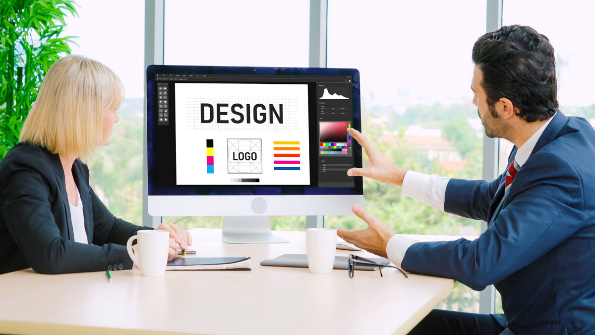
Graphic design software offers many tools to help you achieve precise alignment. Here are some popular software options and their alignment features:
- Adobe Photoshop: Offers alignment tools, including the Align panel, which allows you to align layers and distribute spacing evenly.
- Adobe Illustrator: Provides alignment options for objects and text and the Align panel for precise alignment control.
- Adobe InDesign: Ideal for print layouts, InDesign offers comprehensive alignment tools, including options for aligning to margins and columns.
- Canva: A user-friendly platform with alignment guides and snapping features for easy design alignment.
- Figma: Known for collaborative design, Figma includes alignment and distribution tools for design teams.
- Sketch: Offers alignment and distribution options for vector graphics and user interface design.
Explore these software options to find the one that best suits your graphic design needs and aligning preferences.
Conclusion
In graphic design, mastering alignment is like mastering the art of composition. It's the underlying structure that elevates your work from mediocre to exceptional. Alignment provides the order, clarity, and cohesiveness that make your designs stand out and resonate with your audience.
As you continue your graphic design journey, remember the fundamental principles of alignment. You have various alignment techniques at your disposal. Also, consider the role of white space and invisible lines. Stay attentive to details, avoid common mistakes, and leverage alignment tools in your chosen design software.
You now have the knowledge and skills to create visually cohesive compositions that captivate and communicate effectively. Embrace alignment as your trusted ally in graphic design, and let it guide your creative endeavors to new heights.
FAQs (Frequently Asked Questions)
1. What is the role of alignment in graphic design?
Alignment in graphic design is essential for creating visually cohesive and organized compositions. It guides the viewer's eye, establishes hierarchy, enhances aesthetics, and ensures effective communication.
2. What are the fundamental principles of alignment?
The fundamental principles of alignment include the Rule of Thirds, grid systems, and balance/symmetry. These principles provide structure and order in graphic design.
3. How does white space contribute to alignment in design?
White or negative space complements alignment by providing breathing room for aligned elements. It enhances readability, prevents clutter, and improves overall design aesthetics.
4. What are some common alignment mistakes to avoid in graphic design?
Common alignment mistakes include inconsistent alignment, overcrowding, neglecting margins, overusing center alignment, ignoring hierarchy, and misaligned text.
5. Which graphic design software offers alignment tools?
Popular graphic design software with alignment tools includes Adobe Photoshop, Illustrator, InDesign, Canva, Figma, and Sketch. These tools help designers achieve precise alignment in their creations.


